Analytics
TGmembership has an add-on that you can use to analyse the sales made through your bot, find your strengths and weaknesses and adapt your marketing strategy. There are two versions of this module - a built-in bot analytics command that offers basic statistics on sales and revenue, as well as more detailed analytics add-on available through our web dashboard - this option includes more information and charts. By using the premium add-on, you will have a deeper understanding of the effectiveness of your products and services. In this article we will focus on the premium version of the analytics add-on.
Membership Metrics

This screenshot shows a comprehensive overview of the key metrics you need to know about your Telegram subscription bot service. The 'Users' box displays the total number of people who have interacted with your bot, while the 'Members' box shows the number of users who have an active membership. The 'Conversion' box indicates the percentage of users who have an active membership, giving you an insight into how well your bot is converting users into paying subscribers. Finally, the 'Churned Users' box displays the number of users who have previously subscribed to your bot but are no longer active members. By keeping track of these metrics, you can make data-driven decisions and improve your bot's performance.
Revenue Growth and Progress
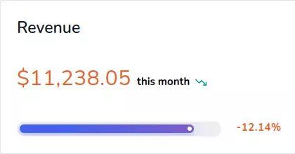
This screenshot shows the revenue generated by your Telegram subscription bot service this month. You can see the exact amount of revenue earned, and whether it has increased or decreased compared to the previous month by looking at the small trend icon next to the amount. The progress bar underneath the amount indicates how close you are to reaching the previous month's revenue or shows the percentage growth compared to the previous month. The string next to the progress bar displays the exact percentage of growth achieved. By keeping an eye on these metrics, you can track the growth and success of your bot service, and make informed decisions about your marketing and sales strategies.
Daily Revenue Chart
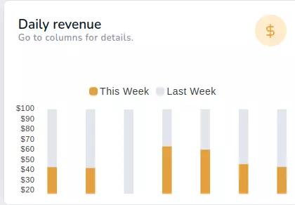
This chart is a great tool to monitor your daily revenue performance. It displays the revenue for each day of the current week and the previous week in a bar format, allowing you to easily compare the two weeks. This helps you identify trends in your business and make informed decisions on how to optimize your sales. For example, you may notice that your revenue is consistently higher on certain days of the week, which can help you adjust your marketing strategy and promotions accordingly. By keeping a close eye on your daily revenue, you can stay on top of your business and make adjustments as needed to maximize your earnings.
Revenue Summary and Monthly Trends
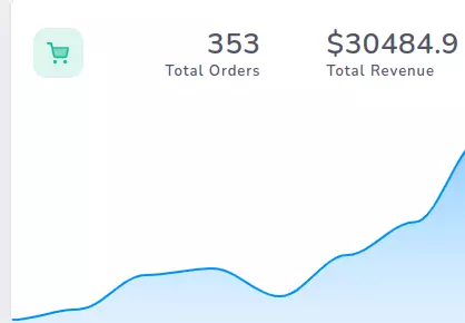
The screenshot shows a line chart displaying the revenue month-by-month. You'll also see a summary of how many orders have been completed and the total lifetime revenue. This will give you an overall picture of how your business is doing, allowing you to easily track your progress and identify trends. The line chart can help you see the patterns in your revenue over time, while the summary gives you a quick snapshot of your business's overall performance.
Payment Methods Distribution
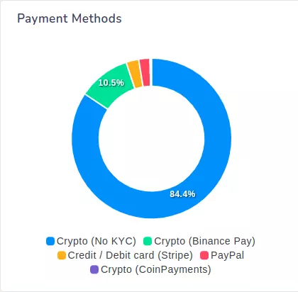
Wondering which payment gateways your customers prefer? Look no further than this pie chart. It breaks down the percentage of orders completed through each payment gateway, giving you an idea of which ones are the most popular.
Revenue Breakdown by Plan
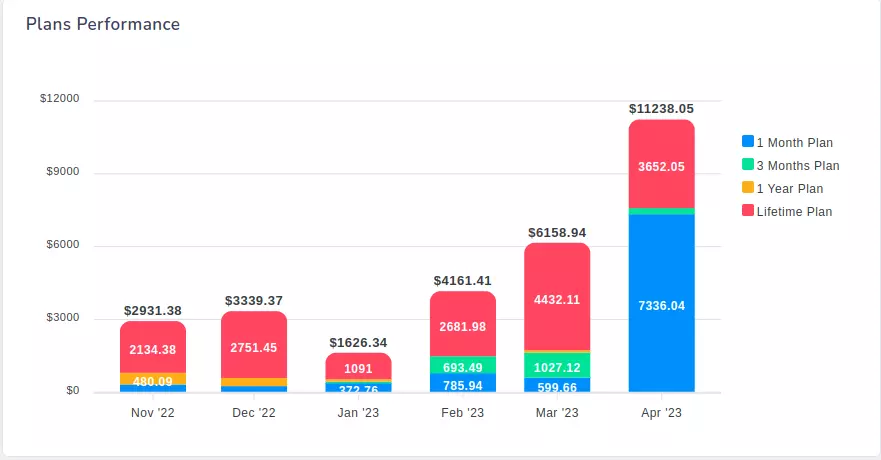
This chart breaks down the monthly revenue by plan, giving you an overview of where most of your money comes from. This chart is particularly useful if you offer multiple plans or tiers with different features and price points. By analyzing the revenue breakdown, you can identify which plans are most popular among your customers and adjust your marketing strategy accordingly. The chart also provides a clear visual representation of how your revenue has been distributed across different plans over time.